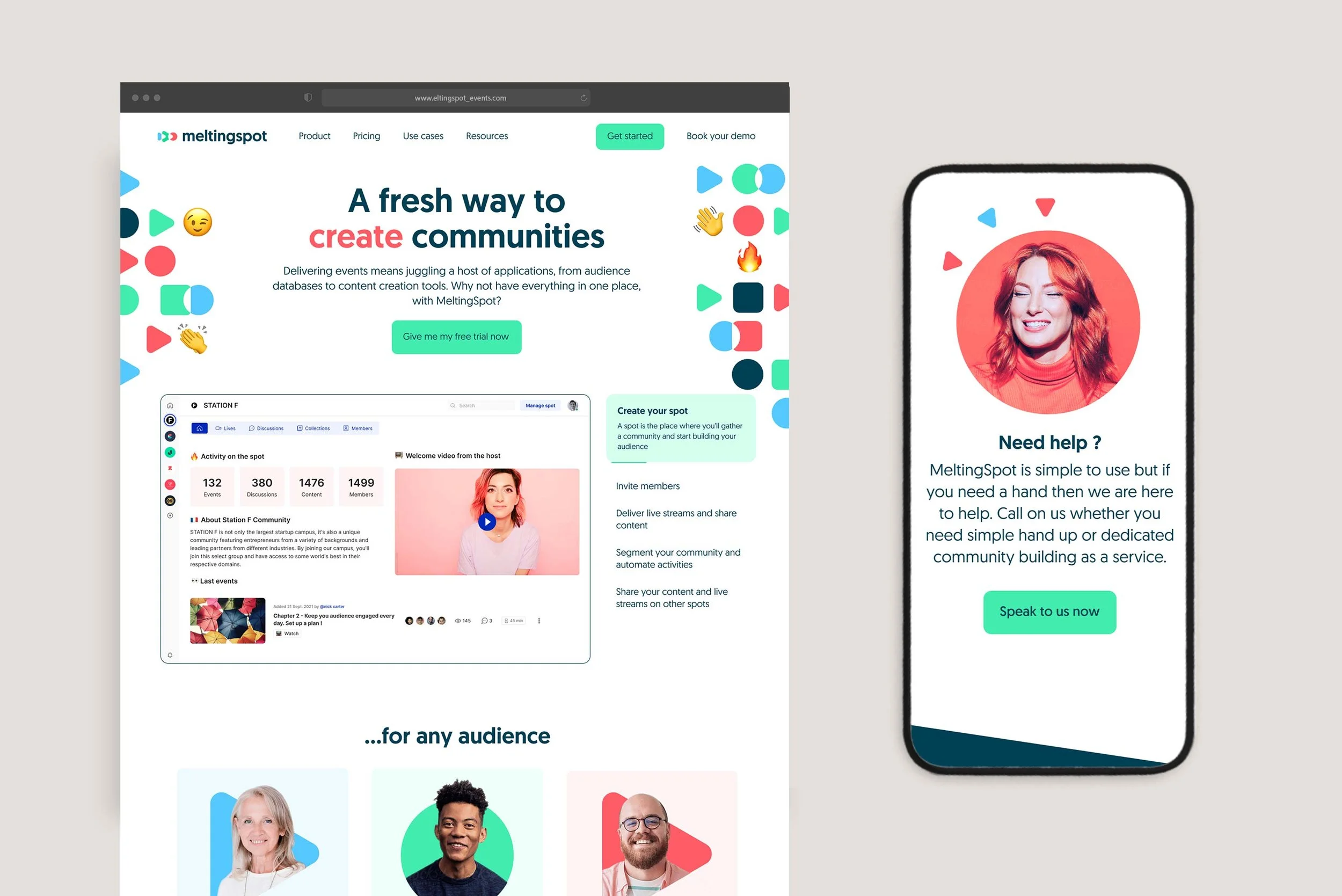
Meltingspot, an events platform rebrand
Rebranded Meltingspot events platform with a dynamic identity system inspired by video iconography shapes that move, grow and adapt across product and marketing.

As Meltingspot's primary designer for two years, I owned the product design vision together with the product owner and executed a unifying rebrand to connect all touchpoints into a single, seamless experience.
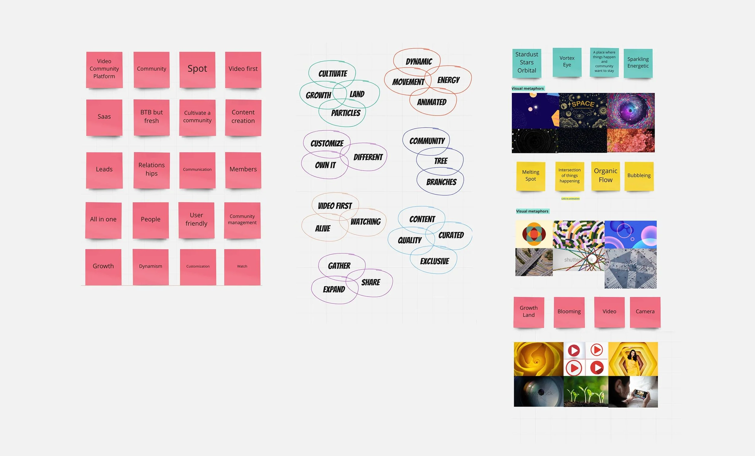
Concept exploration, analysis of competitors and inspiration
The logotype
MeltingSpot has its own symbol, which represents our product based on community (coming together) and video.

-

Shapes concept
A system of shapes inspired on the video iconography and the spot concept that move, expand and grow.
-

Brand behavior
The brand shapes can create a fresh and scalable branding. They can point or decorate, build a system or fill the background.